As you're reading this, dear readers, I am driving my way south, headed to new, uncharted lands (by me, anyway) to the wilds of Blowing Rock, North Carolina. I'll be spending the next handful of days teaching at the Unwind Knitting Retreat, schooling knitters on all things Fair Isle, lace and picot. I'm looking forward to becoming deeply entrenched in the land of knit, surrounded by "my people" and trading stories, yarns, ideas and thoughts. As mentioned in my last post, I teach a lot of stranded color work classes, both technique and in design. I like to throw in some information about color as well, because color and Fair Isle knitting go together like Wheat Thins and goat cheese (trust me, it's a spectacular snack). Color theory and the psychology of color (coming in another post) are downright fascinating and whether you realize it or not, it sways your thoughts, your purchasing history, your mood, your body... Everything.
I get asked frequently about color and often, the next sentence to come out of that person's mouth is "I have no idea how to choose colors, make them go together or even where to start." While I could write a book on what I've learned, I'll keep this knitting-friendly and just scratch the surface a bit in the hopes that you'll hightail it to your library and check out a few books on color theory.
So what exactly is color theory? Wikipedia tells us "that in the visual arts, color theory is a body of practical guidance to color mixing and the visual effects of a specific color combination. There are also definitions (or categories) of colors based on the color wheel: primary color, secondary color and tertiary color. Although color theory principles first appeared in the writings of Leone Battista Alberti (c.1435) and the notebooks of Leonardo da Vinci (c.1490), a tradition of "colory theory" began in the 18th century, initially within a partisan controversy around Isaac Newton's theory of color (Opticks, 1704) and the nature of so-called primary colors. From there it developed as an independent artistic tradition with only superficial reference to colorimetry and vision science."
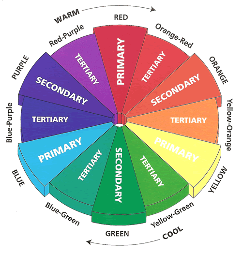
In knitting speak, it's a way to balance colors of fibers so they play off of one another, work together to benefit the design to create harmony, rather than hinder it. In visual experiences, harmony is something that is pleasing to the eye. It engages the viewer and it creates an inner sense of order, a balance in the visual experience. When something is not harmonious, it's either boring or chaotic (and in knitting, it can start to look muddy). At one extreme is a visual experience that is so bland that the viewer is not engaged. The human brain will reject under-stimulating information. At the other extreme is a visual experience that is so overdone, so chaotic that the viewer can't stand to look at it. The human brain rejects what it can not organize, what it can not understand. The visual task requires that we present a logical structure. Color harmony delivers visual interest and a sense of order. There are 3 basic types of color categories:
Primary Colors: Red, yellow and blue In traditional color theory (used in paint and pigments), primary colors are the 3 pigment colors that can not be mixed or formed by any combination of other colors. All other colors are derived from these 3 hues.
Secondary Colors: Green, orange and purple These are the colors formed by mixing the primary colors.
Tertiary Colors: Yellow-orange, red-orange, red-purple, blue-purple, blue-green & yellow-green These are the colors formed by mixing a primary and a secondary color. That's why the hue is a two-word name, such as blue-green, red-violet, and yellow-orange.
We could go in even deeper and talk about lightness, saturation and hue (those terms probably sound familiar to you if you took Art 101 or ever played around in Photoshop) - lightness (light vs. dark, or white vs. black), saturation (intense vs. dull) and hue (e.g., red, orange, yellow, green, blue or purple). We've also got our warm colors (red, orange, yellow) and our cool colors (green, blue, purple). We've got our pure achromatic colors (commonly known as the gray scale), tints and shades, split complimentary, complimentary, RGB vs CMYK, the list goes on and on. Learning about color is like learning about knitting - you'll learn something new all the time.
So how do we apply what we learned above in my brief Color 101 lesson to our knitting? My advice - get yourself a color wheel. If you're one of those people who struggle with color, buy a detailed wheel at an art store and keep it in your knitting bag, or throw it in your purse when you're going to your LYS. Basic rules of thumb are this: things opposite on the color wheel (complimentary colors) ALWAYS look aesthetically pleasing and play well with each other. Same goes for your primaries, secondaries and tertiaries, if you plan on using more than 2 colors. Your split complementaries will look good as well. Draw a line from one color to another and they'll work, make a triangle or a box and they'll work, too.
I've noticed that some knitters have a hard time envisioning the fair isle project they want to knit in colors other than what is shown. After you've downloaded your pattern, print it out in black and white. Take all of the color out of the equation and start from scratch. Bring both your black and white print out and your color wheel to your LYS, lay fibers down in the color wheel sections and start playing around with them. Sometimes color is a feeling (as in "I love how this looks, this just feels right") and sometimes it's more scientific (as in "green and red are complimentary colors and I know that the colors will play off of each other well"). If you're gift knitting, maybe keep in mind what colors your recipient wears and tends to stay away from, eye color, skin tone, climate, fiber preference, etc.
Using one of my recent Fair Isle patterns, the Simon Says Cowl, I've played around a bit with the colors in Photoshop. Here we have the original picture next to the same image in black and white with all color information removed:
Completely different feel, correct?
Now what if I played around with the hue and saturation settings?
 Wow! Not only does the look of the cowl change, but the feel of it does also. Color is amazing!
Growing up with an artist mother, I have been deeply submerged in the world of art and color since day 1. I suppose at some point I learned the technicalities of color and science, but when choosing colors, I go with my gut. I know what works, I know if the colors will play off each other or turn to mud when knit up and what to avoid. My #1 advice for color choices? BE BRAVE. Try something new! Yellow and purple freak you out? Guess what? They're complimentary colors, they're aesthetically pleasing. On the flip side, just because science tells us they'll look good together, you may personally not like that combination, but that's the beauty of walking into your LYS, making a choice, trying something new and coming up with a color combination you may never have gravitated towards.
Embrace color and don't be afraid that you'll "mess up." It's your project, your vision, your choice! What color combinations have you tried lately in your knitting that made you swoon?


